Somebody posed the right question the other day when I asked on Facebook for reactions to the new design of The Ledger’s print edition: Why did they do it?
Since I haven’t been on the inside for nearly three years, I don’t know the specifics, but there are several business reasons to redesign a publication: reduce costs, gain efficiency, increase sales, improve branding.
IMPROVE BRANDING: I got some insights into some branding wins when I showed the paper to a couple of thirtysomething graphic designers. They loved it.
Specifically they liked the way the newspaper looks more like a website: brighter colors, more white space, type in the nameplate and at the top of pages that reminded them of website menus.
Imagine that: Designing for the younger readers you want to attract. (If you really want to attract young readers, you’d focus on your website; more on that later.)
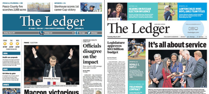
INCREASE SALES: Redesigns often pay attention to the top half of the front page because that’s what potential purchasers usually see in a news rack or in a store. In a market where you’re competing with other publications, you want to look fresh and distinctive.
The clean look and color will help in the battle of the newsracks. That’s not as much of an issue here, where The Ledger no longer has competition from The Tampa Tribune on the west side of Polk or the News Chief on the east side — although there is some competition with the Orlando Sentinel out east.
But this is a redesign being implemented throughout the GateHouse Media chain and some of their papers — The Sarasota Herald-Tribune, for one — face significant competition.
Sometimes a redesign will try to introduce more headlines “above the fold” on the front page to increase newsstand interest. I don’t think that was a factor here. By my count, the last edition of the old design and the first edition of the new design each had six elements that would be visible in newsracks.
GAIN EFFICIENCY: Several elements in the redesign will help workflow in the design center in Austin, Texas, that assembles pages for The Ledger and many other GateHouse newspapers.

color cards
For one, the color “cards” give editors and designers flexibility in the shapes of photos used to promote stories.
Newspaper formats often lock designers into very specific shapes. It can be very trying when you’re on deadline looking for a horizontal photo to illustrate the just-ended Rays game you want to promote on the front page and all the pictures you’re getting are vertical.
This design solves that problem.
By the way, I question the effectiveness of the color promos on the section fronts. The ones at the top of the front page are important for rack sales, but my eye tends to skip over them when I read the newspaper. I don’t know if I’m typical, but I suspect most people gravitate toward article headlines instead of promotional boxes.
REDUCE COSTS: I don’t know if any elements of the new design will help reduce costs at the Texas design center. I will confess the first thing I did when the redesign came out was measure to see if there was any shrinkage in page size. For now, the pages are the same size as they were under the previous design and it seems to me the number of pages are the same, so I’m not seeing any newsprint savings.
Random Thoughts
SPORTS: I’m glad the new design got rid of the declaration at the top of the Sports front that “We’re on social media.” That was a big deal several years ago. It’s expected now.
HEADLINE FONTS: Somebody commented on Facebook that readers don’t care about fonts. Maybe. But they know if the newspaper looks modern or tired, dignified or showy. I’m no expert on fonts, but the ones chosen lend a professional look, in my opinion.
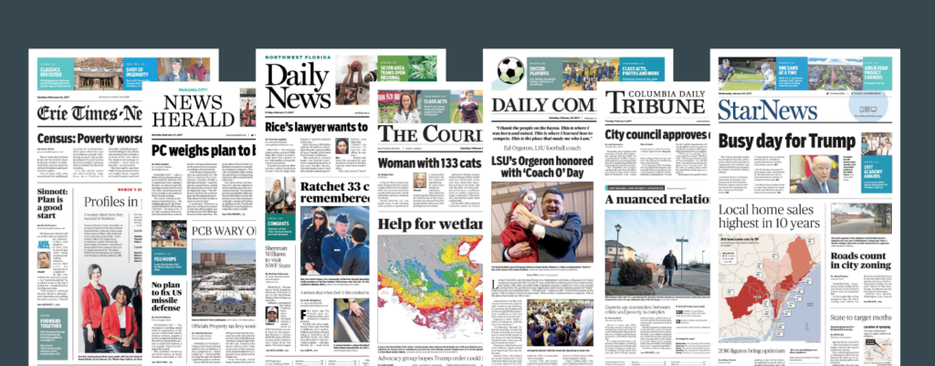
Color schemes at other GateHouse papers under the new design

Sarasota’s cards
COLORS: I was curious about promotions that said “the color palette reflects the hues of Polk County.” Maybe it does. I looked through other GateHouse papers that have adapted the new design, and color themes vary slightly, but it looked to me like the options were from a fairly limited universe. Somebody probably did choose a color combo that they think reflects Central Florida. If it were me, I’d probably have gone for the combo that Sarasota uses; it strikes me as more sophisticated and has a grayish blue much closer to the hue that we’ve thought of as “Ledger blue” for the last few decades. That said, the brighter blue in the new Ledger doesn’t seem too far off from the large AM that dominated The Ledger’s left column in the 1980s.
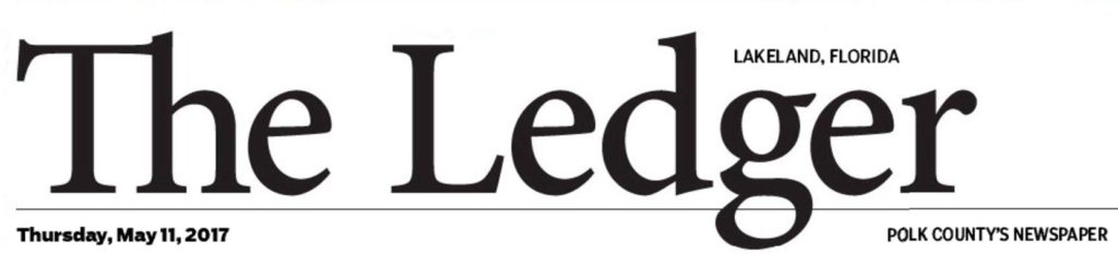
NAMEPLATE: I don’t have a suggestion for improving it, but the lettering for the words “The Ledger” on the front page strikes me as flat. There’s no room in the new design for the blue background that marked the last few designs, but I liked the dimensionality to the lettering on those. A former Ledger design editor from the 1990s said he liked the fact that the new design fixes the “monumentally awful” spacing between letters in the nameplate. I hadn’t noticed, but, yeah, he’s right.
WEBSITE: All in all, the changes to The Ledger’s print edition reflect a respect for the reader and a desire to be user friendly. If GateHouse really wants to grow its reader base, it will build those qualities into the next versions of its websites.

 I'm a digital journalist and recovering newspaper guy who lives in Lakeland, Fla.
Leave a Reply